Hello!
Its been so long since i last wrote anything on my blog. More then 20 days. Have been real busy lately, with my FYP, my freelance and my job.
Have landed myself on a new job lately. I am now a lecturer teaching dip in interactive media. Cool job title huh?
But just a poor lecturer, nothing to be proud of. I currently have 7 student of which 4 turn up. about 60+% turn up rate, not bad already.....
It is a relatively new course in my school and now i finally understand how slack it is to be a lecturer. This is more slack then any of my previous job. I am starting to get tired of the slack nature of it. My lesson time is only from 10am to 1pm. After that, is my lunch time and preparation time for tomorrow lesson.
As being a newbie noob lecturer, i currently only read from slides. However, dun ever think that its easy, you can get tongue tied/ dun understand how to pronounce some words etc these kind of problems.
Somemore with my young and look, i dun really think anyone would believe i am a lecturer. Where to find so young and handsome lecturer? Right?
The reason i'm staying at this job is because it helps me build up my presentation skills everyday and when teaching people, i build up my basics on media stuff. Have been reading books lately and have completed "Flash: Graphics, Animation & interactivity", "Dummies about Flash", "Animation history and aesthetic", "Problem Solving Programming 1 & 2", Dummies about Java" and a valuable amount of wikipedia articles. Cool stuff....
Alright, this is my updates for the past 2 weeks.
Btw the result for the logo will be out soon.
I will also paste some of my newly created webpage soon.
敬请期待!
My playlist
Wednesday, February 25, 2009
Thursday, February 5, 2009
design.i.am studio logo part 2
I am tabulating some comments from my friend about these logo.
Ken Choice
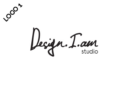
Logo 1
Reason:
hmm... the rest seems abit complicated bah... like u are trying to force ppl to think that ur designing is gd...
logo 1 very simple and elegant...
shows confidence i guess
Lusinda Choice
Logo 2
Reason:
有设计感,颜色很可爱
Zhou Qian Choice
Logo 1
Reason:
看上去比较像会发财的“大牌”!
Vincent Choice
Logo 1
Reason:
mm. of the 6, think tat appeal to me more
Quanda Choice
Logo 3
Reason:
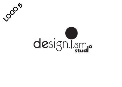
design 5 the i >> i big dot there i find it like strange and snatch away attraction
i take design 3 i becoz there is a line there haha bring out a feel (( smile face feel ))
confused for very long time.
after awhile still choose 3.
logo 3 not bad but the word studio if change abit more will better
logo 5 is nice but i dun like the big black dot
logo 2 is nice but bottom right too empty and i heard that square logo is bad
David choice
Logo 3
April choice
Logo 3
Reason:
Just like the logo but prefer a black background instead
KangYee choice
Logo 5
Reason:
clear simple leaves an impression
Bryan choice
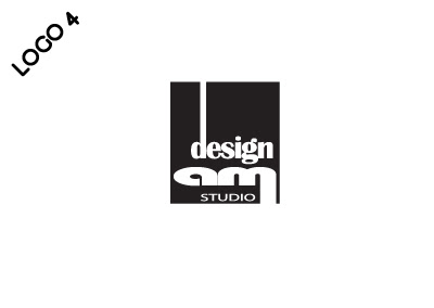
Logo 4
Reason:
look more professional
Jaren choice
Logo 5
Reason:
quite cute
overall depends on wat image u wan to give
Kok Chin choice
Logo 3:
Simple and nice
the design word can be coloured and the AM is too small
Ying Sheng Choice
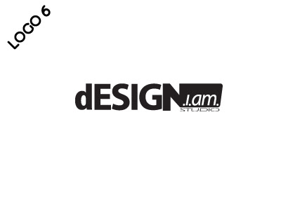
Logo 5/6
Reason:
Elimination method
Neo Choice
Logo 2
Reason:
Same as Lus.
We are thinking now, which should we choose, or should we create more new one's. Nonetheless, Thanks for all of you all help. Logo 2,3 and 5 are the more popular one's. We have comments from professional of all field of work, designers, photographers, financial planner, teachers. We will tell you the result soon.
Thanks.
design.i.am studio logo
As you all should know, me and my gf is starting up a simple design studio for our freelancing work. We have come out with the name design.i.am and started receiving our first business. Our logo will be the next thing out. Below are 6 logo design by both of us. Choose 1 and leave ur comments please...
so which one do you prefer? They may not be the best but we did put in effort in doing them. Thanks for you comments in advance.
 |
| From Misc |
 |
| From Misc |
 |
| From Misc |
 |
| From Misc |
 |
| From Misc |
 |
| From Misc |
so which one do you prefer? They may not be the best but we did put in effort in doing them. Thanks for you comments in advance.
Labels:
Portfolio
Subscribe to:
Posts (Atom)

